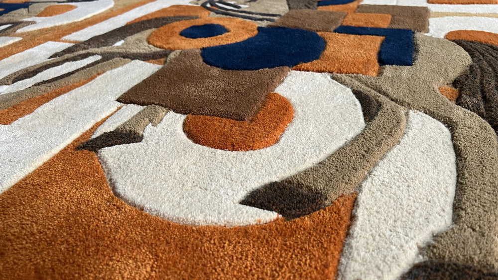
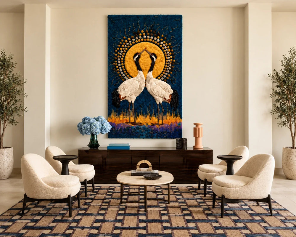
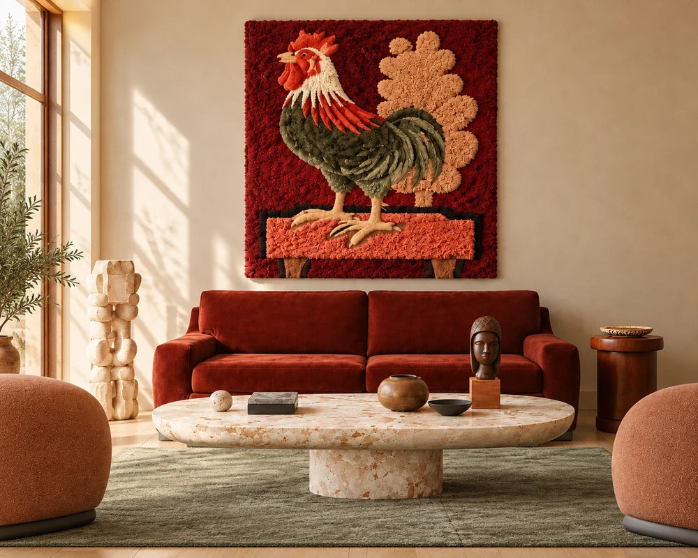
A colour never arrives in wool the way it left the paint. Pigment sits flat and absorbs light; wool has a nap, and a nap throws shadow in one direction and catches light in the other. The same dye lot can read two shades apart depending on which way the pile leans — so the first thing we do with any palette is stop trusting the swatch.
This piece began as a small oil study, no larger than a paperback, all deep marine blues broken by a single band of ochre. Translating it took eleven weeks, four rounds of yarn sampling, and one decision we argued about for three days.
A note on wool matching
Our dye house works in lots of roughly forty kilos. That sounds like plenty until you need eleven blues that sit a half-step apart, and each one has to hold its distance from its neighbours under morning light, lamp light, and the flat grey of a Seattle afternoon. We test in all three before anything is approved. Our Seattle team reviews the design and palette; tufting and finishing take place at our partner workshop in China.
The argument was about the ochre. In the painting it is a thin, almost accidental stripe — a brush running out of blue. In wool, a thin line reads as an error unless it is carved, so we cut it two centimetres proud of the ground and let the shadow do the work the brushstroke used to do.
Set the sketch beside the finished panel and the differences are obvious, but they are not losses. The wool version has weight the study never had — you read the ochre before you read the blue, because it stands closer to you.
"Translating a painting into wool taught me how much I depended on brushwork. Now I think in fibres."
— Vanessa Deng
Eleven weeks is a long time for one panel, and we will not pretend it scales. But a palette only has to be solved once — the eleven blues we mixed for this piece are now in the library, and the next design that needs deep marine will start three weeks ahead of this one.